Table of Contents
Configuring Dashboards
Updated
by Ragnar Tryggvason
Basic Control
Setting up a new Dashboard
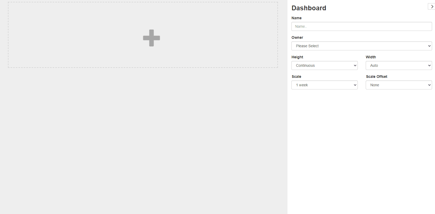
To create a new Dashboard, go to Setup > Dashboard and click on the  icon.
icon.
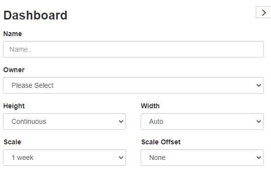
Give the Dashboard a name, an owner, and select if the height of the dashboard should be continuous or one screen. Set the Width to auto or predefined sizes, and select the scale needed (this can be changed when viewing the dashboard).
Select the  icon to view the dashboard in full screen.
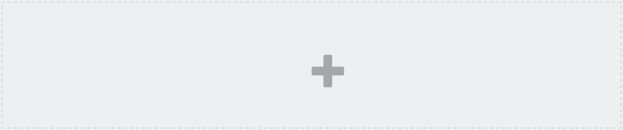
When adding a component to the Dashboard, click on the big plus sign, and select the type of component needed.
The component will automatically take up 1/3 of the row and can be adjusted in size by dragging the component, as seen below.
To delete a component, click on the X in the top right corner of the component and accept.
Dashboard Components.
Alarm Overview
- Select precisely what information is displayed in the Alarm Overview Table. For some projects, it is unnecessary to display all available options so valuable space is not wasted on the Dashboard.
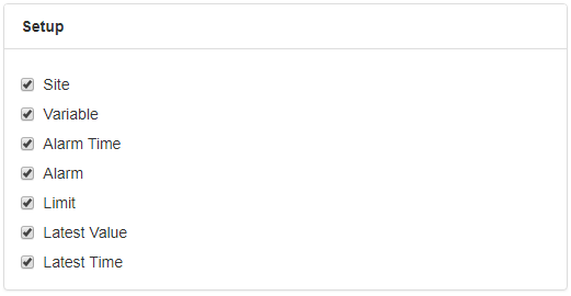
- Select from what Owners and Sites Alarms are displayed
Cumulative Sum Graph
The cumulative sum graph allows the user to compare the cumulative sum of a variable for the current year to the year or years before.
To set up a Cumulative graph on the dashboard, select Cumulative Sum Graph under type.
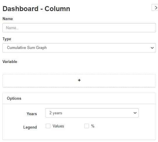
To add in a variable, click on the + icon for the variable selector menu
Under Options, the user can select how many years to compare and if the graph should have legend values or %.
Data Source Command
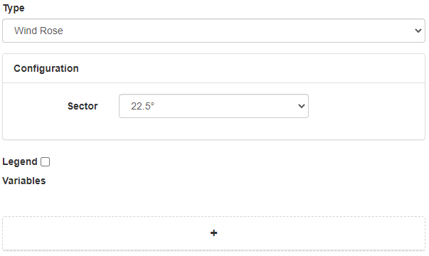
Distribution Wind Rose
Note: Wind Rose doesn’t show unless some variable on the selected site has a Wind Direction (°) defined as a unit.
Wind Rose displays variables in context to wind direction.
Select how many sectors the Wind Rose is divided into and click on the legend check box to see the limits each sector is divided into under the wind rose.
Add variables by clicking on the + icon.
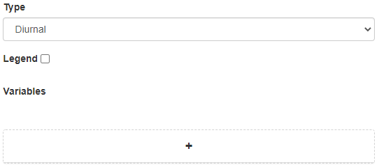
Diurnal
The Diurnal Graph displays the average values hour by hour for all 24 hours of the day. If the time period is more than a single day, the graph shows the average value for every one hour for those days. If the time period is 7 days, the graph will show a single trend line where each hour bucket is the average for those 7 days. It is also possible to put many variables on the same graph, and for every unit type on the graph, a new y-axis follows.
Check the legend checkmark to display variables' names under the graph.
Click the plus button to add variables to the graph.
NOTE: If the scale on the Dashboard is smaller than one day, this feature will not work correctly as it shows the daily hour average for selected variables.
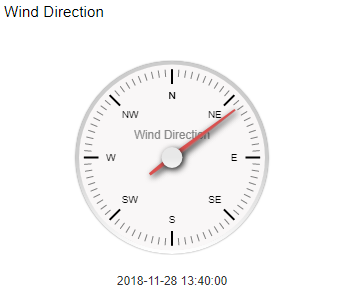
Gauge Compass
To add Compass Gauge to the Dashboard, go to Setup > Dashboard and create a new or edit existing Dashboards.
Create a new box on the Dashboard by clicking the plus button.
Select the type Gauge Compass > Select Variable
NOTE: Any variable that has a value lower than 360 can be selected, but this Gauge is made for direction variables that range from 1 to 360
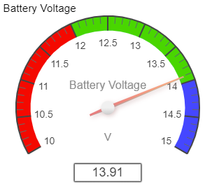
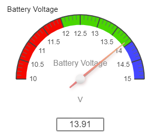
Gauge Needle
To add Compass Gauge to the Dashboard, go to Setup > Dashboard and create a new or edit the existing Dashboard.
Create a new box on the Dashboard by clicking the plus button.
Select the type Gauge Needle > Select Variable
It is possible to select between 3 types of Needle Gauge:
Arc:
Semi Circle:
Semi Circle Vertical:
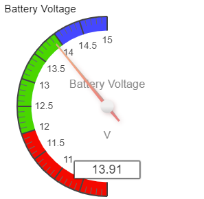
Select the Min and Max values for the gauge
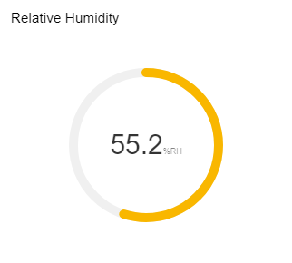
Gauge Progress
To add Compass Gauge to the Dashboard, go to Setup > Dashboard and create a new or edit the existing Dashboard.
Create a new box on the Dashboard by clicking the plus button.
Select the type Gauge Process > Select Variable
The process Gauge has Styles, Arch, Semi Circe, and Circle. The process Gauge always starts at zero, and the Max value can be set.
Circle:
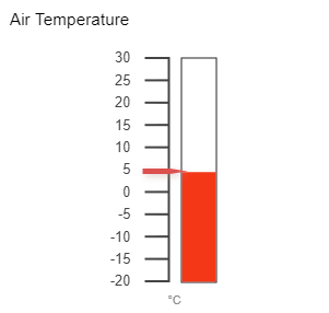
Gauge Linear
To add Compass Gauge to the Dashboard, go to Setup > Dashboard and create a new or edit the existing Dashboard.
Create a new box on the Dashboard by clicking the plus button.
Select the type Gauge Linear > Select Variable
With Linear Gauge, it is possible to show values linear like on a classic thermostat. It is possible to select the Min and Max values, select specific colors for the gauge, and highlight parts of the gauge.
Graph
The Graph option in the Dashboard features a valuable add-on to VDV plotting possibilities.
- Write in a name for the left Y-axis. The Auto Scale checkmark is default checked, and if it is unchecked, two new fields appear where it is possible to select the Min and Max for the manual scale.
- Do the same for the right Y-axis.
- Uncheck the Legend checkmark to hide the variable names under the Graph.
- After selecting a variable to display on the Graph, the following options are available:
Name: Default Station Name: Variable Name appears, but it is possible to change the name to whatever is preferred.
Type: Line, Column, or Area.
Line Width: 1-5.
Color: Click on the field to pick the color from the color picker or manually write the HEX code for the preferred color.
Marker: Select a Marker for each data point on the Graph. Default is None, and it is possible to select 5 different symbols.
Y-axis: Assign variable to either left or right Y-axis.
Data: Select form Raw (Raw values from datafile), Relative Plot (First value on the scale starts at 0), Cumulative (Sums up the values on the scale), or Rate of Change (Where the RoC value = current raw reading – previous reading).
Summary: Default is None, but it is possible to select from Average, Sum, Max, and Min.
Time Period: If Average, Sum, Max, or Min are selected in Summary, this option appears, and it is possible to select Hour, Day, Month, or Year for those mathematical functions. - Click the plus button to add another variable to the graph.
Note: It is possible to have the same variable more than once on each graph, with different graphing or mathematical options applied.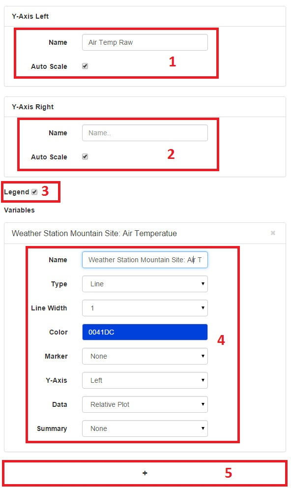
Histogram
The Histogram is a graphical representation of the distribution of data.
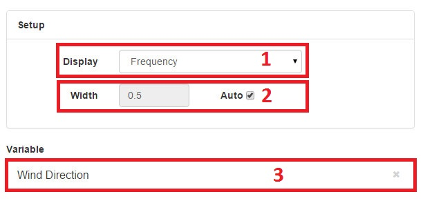
- Select between Frequency (Each bin is displayed as a percentage of the total samples on the Y-axis) or Occurrences (Each bin is displayed as a number of occurrences of the total samples on the Y-axis).
- The bin's width is set to auto by default, but the preferred it can select the preferred width.
- Selected variable for the Histogram. Click on the x to delete the variable and select another.
Intensity Plot
Intensity plot uses color to display 3D data on a 2D plot; this can be useful when plotting temperature or sun radiance and many other variables where the intensity is of interest.
To plot this, select Intensity Plot under Type for dashboard components.
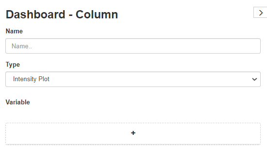
To add a variable to the intensity plot, select the + sign. The variable menu will pop up, allowing the user to select what variable should be on the intensity plot.
Maturity Curve
Numeric
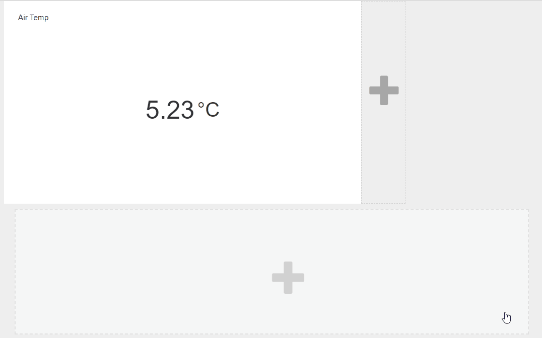
The Numeric value is simply a numeric representation of the latest value read by VDV.
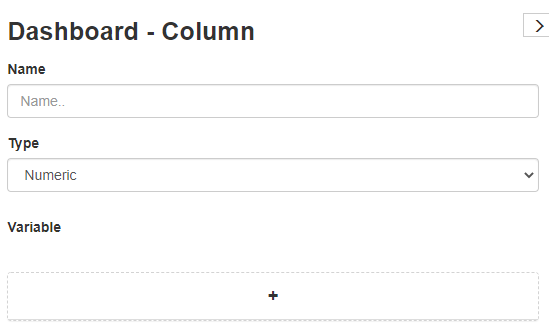
Add the Variable needed by selecting the + sign under Variable.
Photos
It is possible to add photos to the dashboard. This can be convenient for displaying a picture of the company logo, station, or other relevant images.
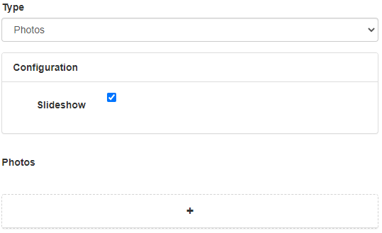
Select the + button to insert a photo from the computer. If more than one picture is selected, it is possible to select the slideshow option to appear in a slideshow on the Dashboard.
Pluviometric Graph
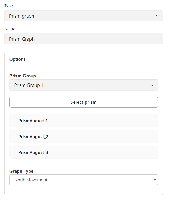
Prism Graph
- Give the prism graph a name.
- Select the Prism group or select prisms to view on dashboard.
- Select Graph type from the dropdown.
Real Time Display
It is possible to add a Real Time Display onto a Dashboard by selecting it under Type. This makes it easy to display your RTD and makes it easy to display them on a fixed Dashboard.
Scatter plot
Add scatter plot to the Dashboard by selecting it under Type.
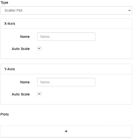
Give the axis a name and select Auto Scale, or by unselecting it, the user can put in a scale of their choosing.
Click on the + sign to add in variables through the variable selector.
Table
The Table is a numeric list of the variable value over time.
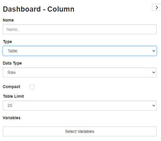
Select the Data type (Raw or summary data) and the table limit from the drop-down list. Add the variable/s by clicking on Select Variable and selecting from a list in the popup window.
It is possible to make the table compact by selecting it.
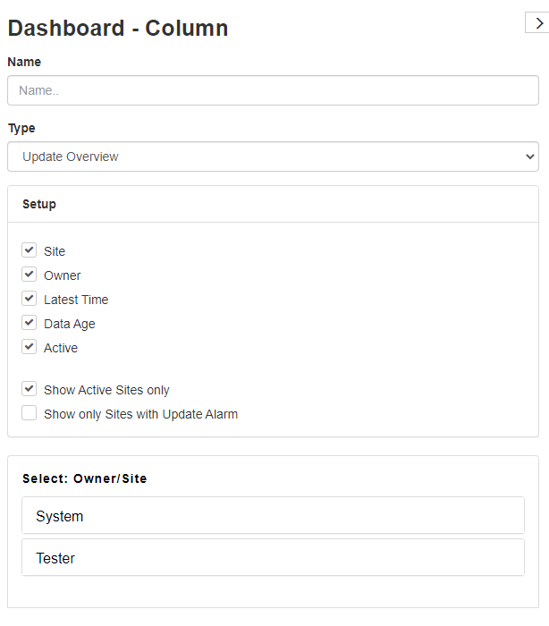
Update Overview
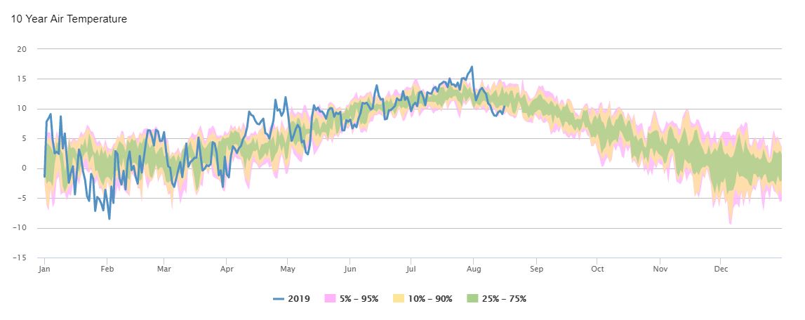
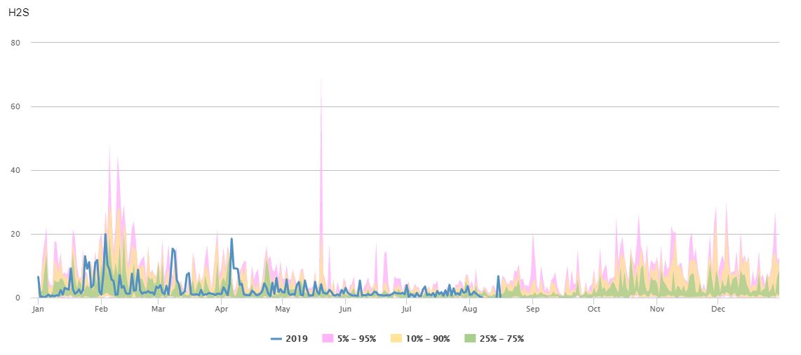
Year Graph
View current data in reference to historical data.
This is a great tool to see how current values compare to previous data—allowing users to instantly see if current data is within historical data limits or if the readings are possibly abnormal.
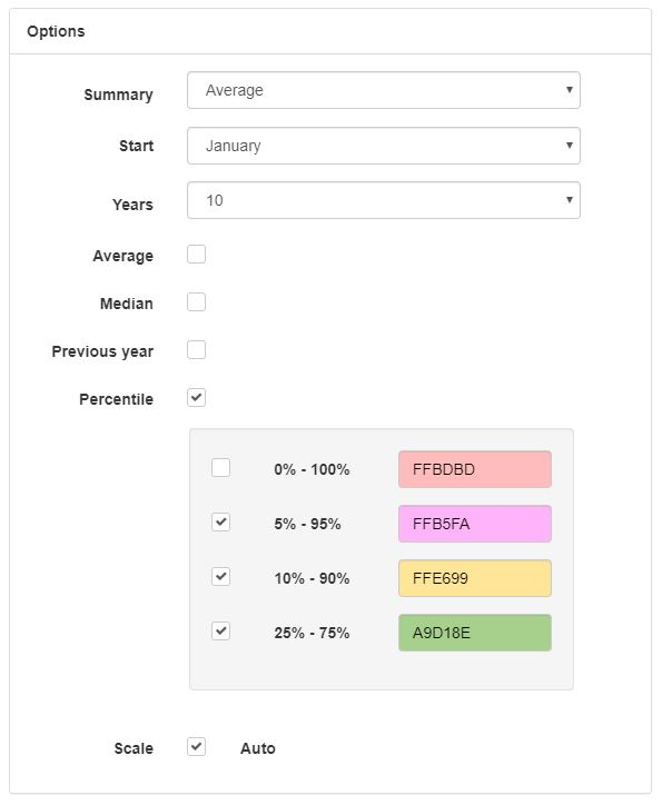
- Select the summary type for the data; the options are average, max, min & sum. Data is summarized to daily values.
- Choose the starting month for the graph.
- Select a number of previous years to include in historical data.
- Show average/median values.
- Show previous year.
- Show percentile values. Select the ranges to show on the graph.
Examples
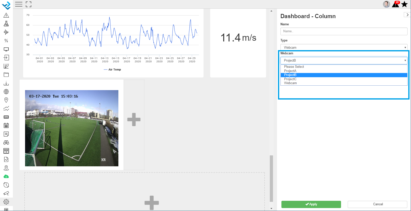
Webcam
Start with selecting Webcam from the drop-down list. You can then add any Webcam that you have access to. It is possible to have multiple Webcams on the same Dashboard.