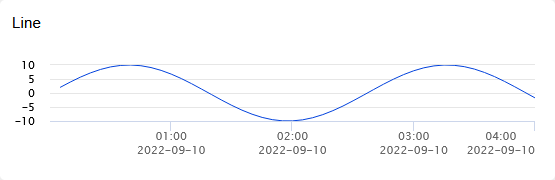
Graph Configuration
VDV includes a powerful graph editor used to customize graphs for Dashboards, Reports and Historical Data.
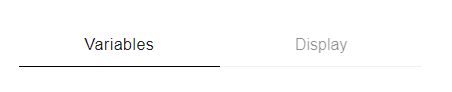
The graph editor is split into two parts. Variables to configure what to show on the graph and Display to configure how the graph looks.
Variables
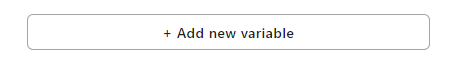
Add new variable
Click the "+ Add new variable" button and select the variable or variables you want to add to the graph, new variables are added to on the top of the variable list
Remove variable
Hover over the variable you want to remove, a "x" icon will be shown in the top right corner, click it and configure the variable removal.
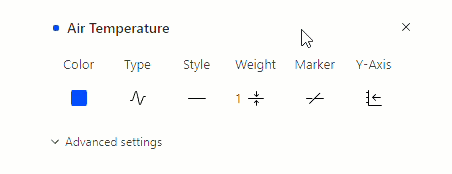
Basic variable settings
Basic variable settings are shown by default with more settings available when "Advanced settings" is clicked.
Color
Used to select the color used for the variable.
Type
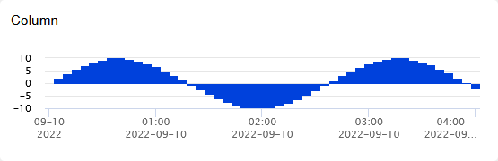
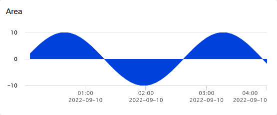
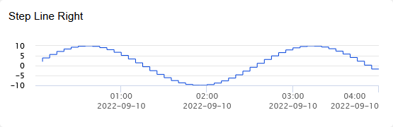
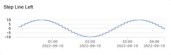
Visualization type
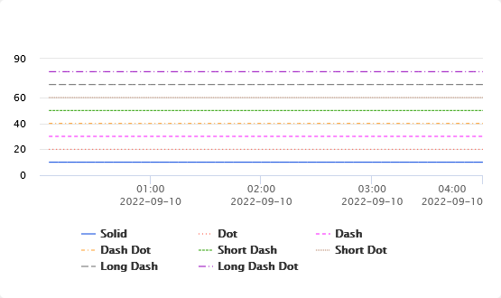
Style
Specify the line drawing style
Weight
Line weight (width)
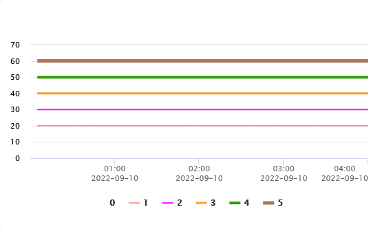
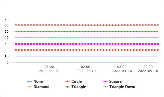
Marker
Data point marker style
Y-Axis
Specifies which Y-Axis is used to show the value scale on.
Advanced settings
Name
The name to show on the graph legend and tooltip, defaults to the variable name unless "Custom name" is checked
Custom name
Allows changing the Name if checked. If this is not checked the variable name will be used.
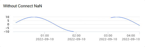
Connect NaN
NaN values are shown as gaps in the graph. This option can be used to connect the last good data points to show a continuous line instead of a gap.
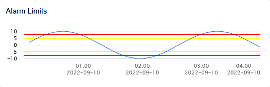
Alarm Limits
Show alarm limits for the variable.
Low/High limits are shown as a yellow line while Low Low/High High is shown as a red line.
Rounding
Rounding precision, select between:
- No - No rounding applied and value is shown as it was imported
- Auto - Number of decimals is based on how big the number is
- 1 to 5 - Number of decimals to show
Summary
Apply summary function to the data, available functions are:
- Average
- Sum
- Max
- Min
- Median
- Average Rolling
- Sum Rolling
- Max Rolling
- Min Rolling
- Median Rolling
Time period (Summary: Average, Sum, Max, Min, or Median)
Specify the time period used for the summary function, available options are:
- Minute
- Hour
- Day
- Month
- Year
Fill Variable
Apply fill between this variable and another
Fill Color
Fill color if Fill Variable is set
Data
Apply data transform, available options are:
- Raw - No transform applied
- Relative Plot - First value on the scale starts at 0
- Cumulative - Sums up all previous values
- Rate of Change - Value = Current raw value - previous value
Advanced settings (Summary)
When Summary is set to: Average, Sum, Max, Min, or Median
Time period
Specify the time period used for the summary function, available options are:
- Minute
- Hour
- Day
- Month
- Year
When Summary is set to: Average Rolling, Sum Rolling, Max Rolling, Min Rolling, or Median Rolling
- minutes
Number of minutes back in time when calculating rolling summary
+ minutes
Number of minutes forward in time when calculating rolling summary
Offset
After the rolling calculations have been calculated an offset can be applied to all values by setting the offset to eighter a negative or positive number. E.g. offset = -5 will subtract 5 from all the values in the dataset.
Advanced settings (Data)
When Data is set to Rate of change
Rollover
Adds the rollover value if the Rate of change is less then 0
Absolute
Show the absolute value of the Rate of change value
Display
Basic settings
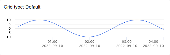
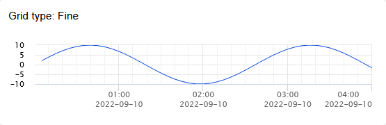
Grid type
Graph grid display type

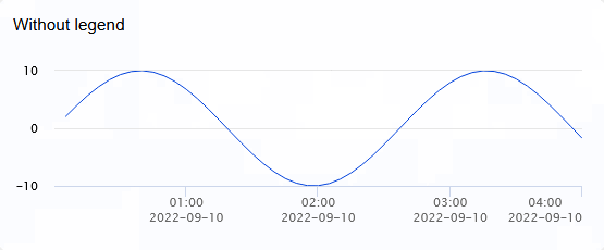
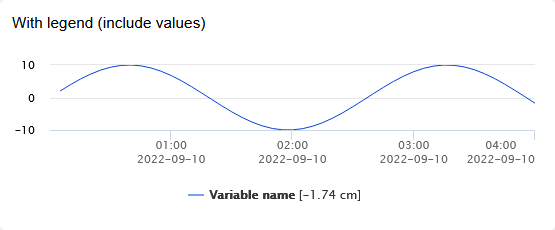
Show graph legend
Show variable legend under the graph
Include values
Include latest variable value in the legend
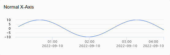
Logarithmic X-Axis
Use logarithmic scale for X-Axis
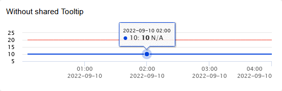
Shared tooltip
Show all variables in a single tooltip when hovering over the graph
Fixed Dates
Set fixed start/stop dates instead of using the time period being viewed
Y-Axis
The left and right Y-Axis can be changed independently and both have the same options, the right Y-Axis is only shown if the graph contains a variable with Y-Axis set to right.
Name
Label to show next to the Axis
Color
Color used for the axis scale label
Auto scale
Toggle between auto scale and manual min/max scale
Reverse Scale
Reverses the axis scale and displaying of all variables using that axis

Logarithmic
Use logarithmic scale for the axis
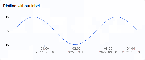
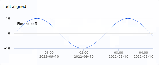
Plotlines
Plotlines are horizontal lines running through the graph at some value
Name
Name for the plotline
Color
Color used for the plotline
Line Weight
Weight (width) of the plotline
Value
Where the plotline should be drawn
Show Label
When checked the plotline name is shown over the line on the graph
Label Align
Set label alignment at left, center or right side of the graph
Layers
The layer feature can be used to add a piezometer layer indicators and variable indicator. The feature must first be enabled by checking the switch right of the layers header.
Creating layers
Layer definitions must first be created before they can be added to the graph.
Adding layers
Click on the "Select layer" input and select the layer you want to add, it will be added to the list below. Set the Stop value to where the layer should stop.
The same layer can be added multiple times.
Variable indicators
Each variable can be added as a indicator on the graph by setting the checkbox left of its name and settings its high value.